
Playing with color
I want to thank all of you who have left such kind, thoughtful comments and fascinating observations on my illustration this week. I am always incredibly honored to receive the feedback from this group of talented and creative people. I am often asked how I've created a particular illustration since I don't usually add that after my other commentary. I guess I don't want to ramble too much... Anyway, this week, the talented, witty, and always informative Jeope said that it would be interesting if I were to "dish on the process more often," so dish I will!
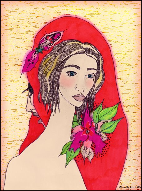
The drawing above is the original version, done with a micron pen and markers on bristol. I used a little bit of water on a brush to bleed the edges along the hair. I scanned it and then put in the background and a little bit of highlighting on the face using photoshop. I turned it blue for the illustration below by adjusting the hue and saturation and changing the background. Very simple!
posted by carla at 9:04 PM
![]()


31 Comments:
Love it,very simple for you! I need a ten page instruction sheet! :-)
This is fab - I love hearing the story behind the process and the difference in hue changes this whole illu so profoundly. I do think the cooler colours complement the main figure perfectly. Thanks so much for sharing this!
thank you SO much for sharing your process. it's so fascinating! what kind of markers do you normally use?
the red is vibrant! I love the green leaves against the hair, they really pop off!
Hi Carla,how are you doing?
I caught flu and was like dead for days...
Amazing how colours give us different feelings isn't it?We change the hue and there we have!A whole new perspective about something.
... about my books, sooner than you'll expect you'll be able to get one in published in your own country :-)
... you live in Connecticut by the sea or in the upper side?
WOW - this is wonderful! It looks like it has a story behind it. I love seeing everyone's process too. Thanks for your nice comments. I'll be back!!
Thanks for the behind-the-scenes info. I always like seeing what a hue/saturation shift will do to change the mood of an illustration, hey?
PS: I also adore the Micron pens. They travel with me always!
I didnt have enought time to take a look the blogs,now Idoing my homework hehehe taking a look all of them :P... What I can said, you everyday are doing better to better ;) to great ;) I love this version is truly beautiful and the color are great !!! I love the character too and again a see alot of work in details, beautiful!! keep working :)
Wowee!! This completely changes the mood! Gives it a real holiday feel, too. Good idea to write your process. I hardly write anything at all, but maybe I will add my medium next time! :-)
wow carla, I think I love this even more.
is that background hand made?
(edit: I just saw that you put in the background in photoshop.
is it just blank bristol board in the original?)
I have never seen a micron pen, but I'm going to have to find one.
this is super lovely.
great stuff.
I do like this more with the reds than the blues.
love scott
I love the details and delicate lines in this image Carla. I like the "blue" version, but this more vibrant one is even better!
Oh I agree with everyone, it's WONDERFUL to read about how you create--since you are so creative and have such a unique style. Very simple, my foot. Exquisite.
I like the red one better for some reason too--it fits the vibrancy of the young woman's face. This is such a wonderful illustration for the duality we all have in us.
WOW..really love your style. Unique..and elegant as usual.
Excelente!!!
-Marjorie Ann
thanks for your comments, i alway look forward to hearing from you. I know it must be so beautiful where you live! Maybe you will show us a little when you have some free time. You probably dined at the inn of the 7th Ray. It is a restaurant(mainly Veg) that sits above the creek and has sparkling little lights. very nice... i'm glad you have been here. sb is beautiful too.
this is my favorite. red is a favorite color. i like how you did the flowers and leaves....i wanted to dig down regarding something i see in it but can't do it now.....i have to rest my eyes now.
.......thanks
Hello, The red really lifts the illo. The blue tone makes me feel sad where as this one has a sense of loving and living.
thank you so much for your feedback on my illos!
This is cool, Carla. It reminds me of art from a record cover my parents had when I was a kid. I think it was either the Mams and the Papas, or Peter Paul and Mary.
Nice to see the variation too, they definitely convey very different emotions even though they're the same art.
By the way, if you're interested, I posted a movie quiz on my site. There's even a prize!
Love both of them! Cool!
I much prefer this one. It's far more vibrant, full of life. The other is lovely, as I said, but this is definitely my favorite. :0)
I love this one. Is that a Pointsetta (sp?). Very beautiful!!
wow. amazing what a colour change will do the message. wonderful illustration.
Carla, it is amazing how different the drawing looks with the different colors. Both are beautiful but so different. Thank you also for the comment you left for me on my drawing. Your words were SO helpful, intuitive and reassuring for me. Thank you! Brandi
These colors really make the drawing come alive! ;)
Interesting how colors changes the mood of a drawing.
Looking forward to your 'surprise' drawing
Can't decide which version I like. They both offer something different! (and I am glad to find I am not the only one that has several versions of the same piece LOL)
Marie
"Simple" for you my dear!
I like both of them - more the Blue version, but is only personal taste for images that emit tranquillity
And, yes - play with colors is a great game
I am waiting for more...
This is beautiful. I love this version too!! It has completely different feel from the blue one. Both are lovely!
I really enjoy the hair in this illustration. Nice work!
simply stunning. diggin both versions.
Drawing can be a wonderful tool for creativity.
... After all,after effects... It is very, very beautiful artwork!
Carla, I have no words to tell you how much I love your art! The freshness and sharpness of colors enchanted me! Thank you for inviting me.
Post a Comment
<< Home